Five Tips For Dataviz on Instagram
Instagram is the 4th most-used platform on any mobile app. More than a billion people use it every month. If you are considering it to show off some work or try out some new ideas, here are a couple of tips.
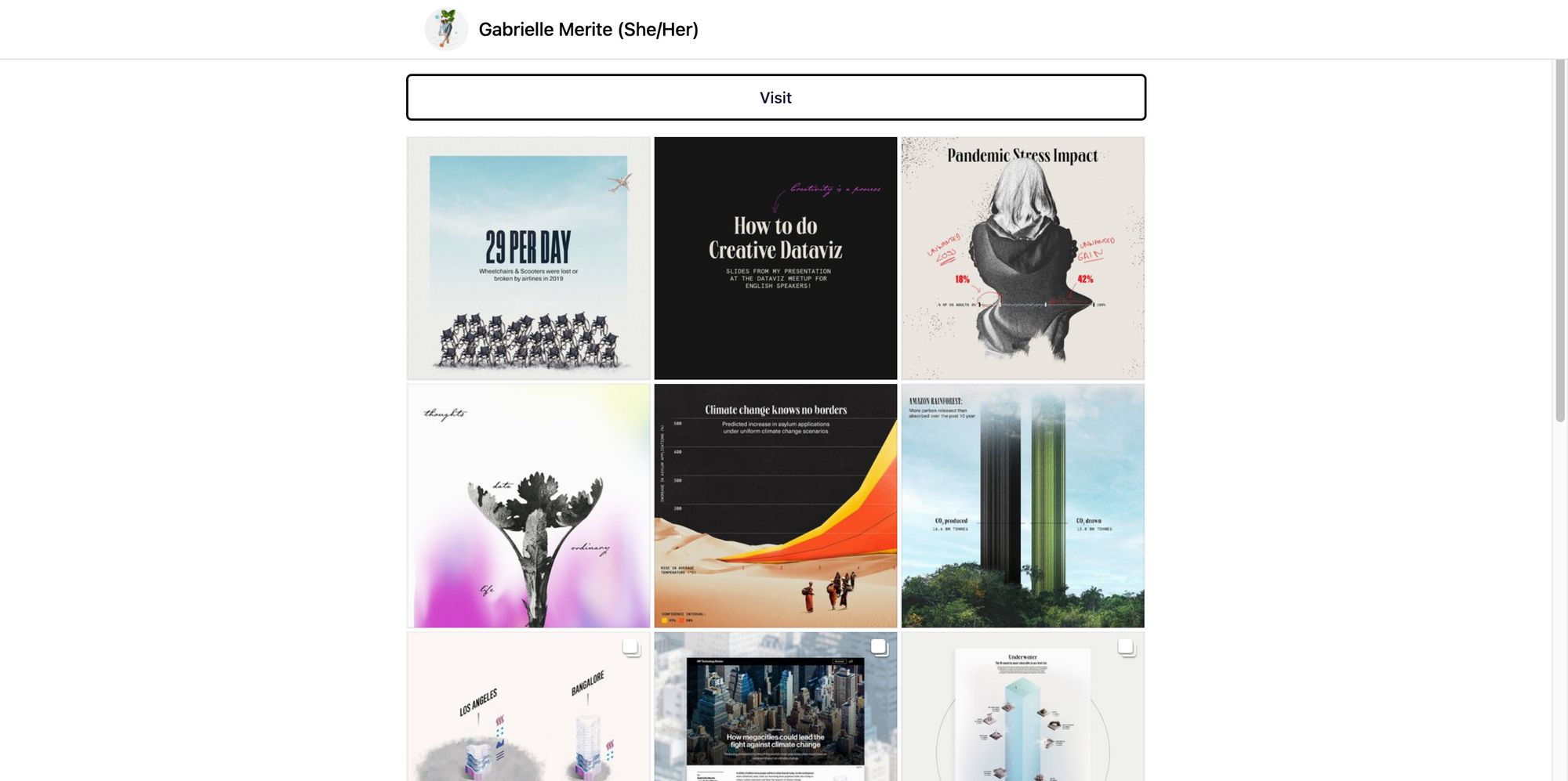
Is there anything I’ve done in the last two years, it’s creating a lot of data designs for Instagram. It wasn’t meant to be a marketing strategy. It wasn’t meant to be a portfolio piece. It was meant to be an exploration of my own style and what I believed in. It became a place where I get feedback, inspiration, and community.
Less is more
When it comes to Instagram, massive maps, infographics and other very large data designs don’t work on the platform. The reason why is simple: the format don’t allow for zooming or enjoying details. Of course, you can choose to show a close-up of your work for more details. But your followers won’t be able to get the direct message or read the legend right away within the platform.
Adding a Click-to-Action to bring the reader to a PDF or a page to explore can be a good work around. However, I’ve noticed that most people won’t click on links because of how difficult it is within the platform (whether you use a link in your Bio or the www written in the caption).
For this reason, my most successful designs have been those with a very straightforward message and simple data. Think bar chart, or lines chart. Nothing fancy but efficient.
Go Big or Go Home
Let’s talk size for a minute. Most people will use Instagram on their phone. Except if one has a one of these massive XL Iphone that don’t fit in your pocket, that means the screen will be small. Plus, Instagram is made for square content – 1080x1080px to be exact. For this reason, make sure that your legend, details, titles are set in a very large font size.
I’ve been guilty of writing tiny annotations, sometimes. Let me tell you, I got complaints. Nowadays, I don’t go under 35pt for text, specifically numbers on axis, and under 45pt for any important annotations.
Title it
This didn’t come naturally to me. I thought Instagram users were only interested in the visual aspect of things and would take the time to understand the graph. I’ve quickly realized that the message sometimes gets lost if there’s no title.
Contrary to what you would do on a research paper or a news article, I do not write my title to describe what is contained in the data visualization. I use it to describe the main message of the data visualization. For instance: “Climate Change has no border”. If needed, I’d add as a subtitle explaining what the values and axis are “Predicted Increase in asylum applications under uniform climate change scenarios”.
Yes, this is the opposite that what is recommended in data visualization. However, this makes the post more sharable and drives the user through a headline, then lead them to the details of the data.
Make it Participative
That is a personal advice, but I love the idea of making Instagram a place of feedback of sharing resources. A friend reproached me a while back of always talking about issues but not offering any solutions. Today, I’m still exploring ways to make every data visualization a place of discussion.
A few solutions I found:
- Adding a question in the caption. Its encourages followers to answer, share their insights in the comments.
- Tag a person or an association’s account that followers can check out for more information on the issue I’m highlighting in the data.
- Reference a resource outside of Instagram for the same purpose. To do this, I use the free site linkin.bio (within Later). It allows me to add a hyperlink per post. Either to an interesting resource, article or to the original source of the data.
Accessibility
Overall, accessibility on Instagram is limited. Here are a couple of rules I recommend on Instagram:
- Make sure all texts including the visuals is legible: see point above about sizes.
- Alt-text exists on Instagram! Here is a tutorial.
- Add your Alt-text in a comment starting with [ID]. Some screen readers don’t read well the alt-text option on Instagram.
- Write your hashtags with #EveryWordStartingWithACapital Letter. It makes the hashtags easier to read for anyone who have vision difficulties.
Bonus point: Be Yourself. This is not your portfolio.
This may be contentious. A lot of artists, including successful ones, use Instagram only as a way to promote their new piece of work. These very aesthetic posts can be quite intimidating, and sometimes (honestly) boring. I found myself getting more positive feedback from posts that may not be perfect but were authentic to what I believe in.
Use the platform to explore your own style, your own values, your own favorite data. Consider also that Instagram may not the best platform for your data pieces (especially if you love huge infographics). That’s okay too!