How to Integrate Hand-Drawn Elements in Your Workflow
What are designers actually doing with the sketches they make? And how can you start creating hand-drawn elements to enhance your dataviz workflow?
In this article, I'll share four common ways to integrate hand-drawn elements into your design workflow:
- brainstorming
- storyboarding
- illustrating
- presenting
Tools
Here are a few tool suggestions to get started drawing:
- Pen and paper
- Procreate app for iPad ($10 USD)
- Affinity designer app for iPad ($22 USD)
- Adobe Illustrator app for iPad (free if you have an Adobe account that includes Illustrator)
- Adobe Fresco app for iPad (free)
- Tayasui Sketches app for iPad (free)
Brainstorming
What
Use hand-drawn elements to brainstorm different ideas without being limited by your dataviz software.
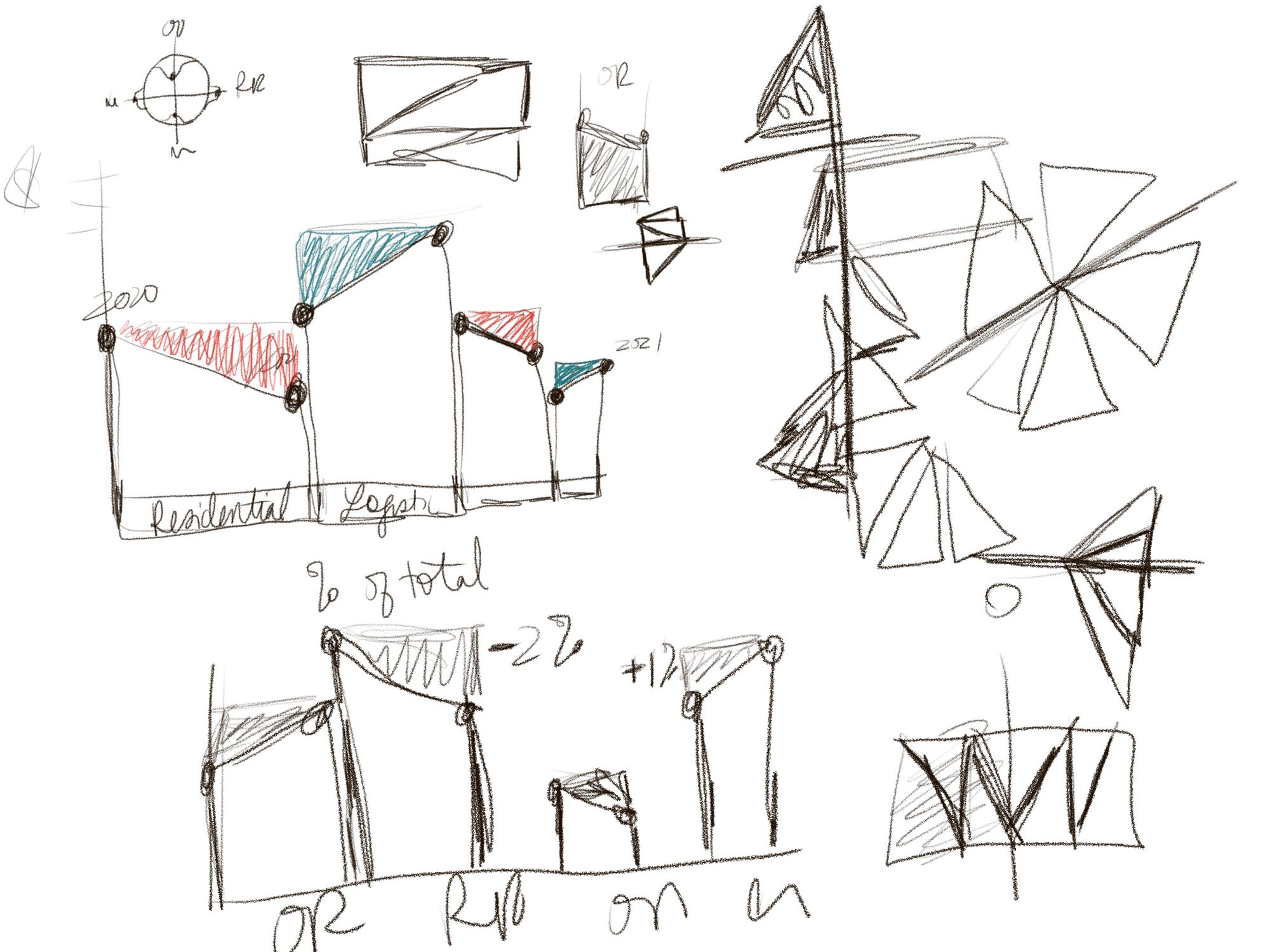
Duncan gave a great primer for brainstorming by sketching in this post. Basically, you're trying out different visual encodings for your data by hand-drawing shapes. This is especially helpful when your client wants (or the data needs) a more novel chart type.
Why
Sometimes it's easier to try out different ideas without being constrained by what your dataviz software can actually make. You can quickly iterate through ideas and see if they make sense.
Often it's beneficial to send your client the sketches of your ideas so they understand that your work in the brainstorming phase is not the final graphic. Sometimes I'll make a sketch, bring it into a dataviz software to make sure it actually works with the data, and then still present the sketch version to the client!
How
Here's a video showing the basics of opening up Procreate and just sketching!
Storyboarding
What
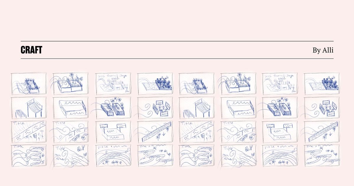
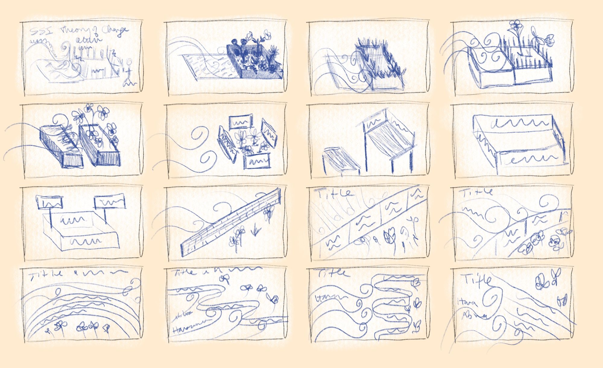
Use hand-drawn elements to map out how different visuals will work together, transition, or sequence. Basically sketching how the visuals in the story could play out in small boxes on the page.
This traditionally looks like thumbnails with small sketches within each box that represent a snapshot of time. I also use a grid of small thumbnails to try out different compositions for a single infographic. It's kind of like seeing the zoomed-out view of an infographic to see if the layout looks good.
Why
It's very common for dataviz designers to create a series of charts, animated charts, scrollytelling stories, or interactives. Planning out how that all works together is very complex.
You can save yourself a lot of time by just sketching a series of boxes first and filling out the sequence of screens. Use this to talk through the project with your client too! It'll help make sure you both are on the same page before you start building.
How
Here's a video of how to create a storyboard example in Procreate.
Illustrating
What
Use hand-drawn elements to create small spot illustrations to add to your dataviz or you can hand-drawn an entire infographic!
A few examples:
- For a recent project, I drew a line art human face to use as an icon because we wanted it to look more friendly than the usual filled-in head icon.
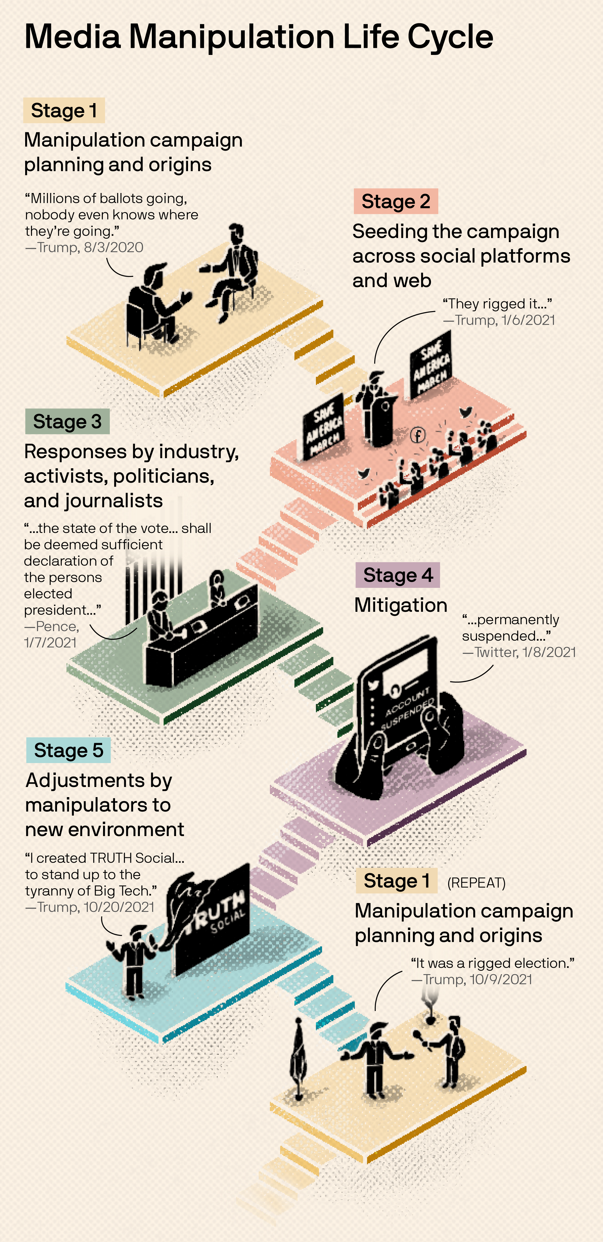
- I hand-drew this entire infographic explainer for Axios (except for the text, which I added after in Adobe Illustrator).
- I used the texture concept recently where I made the texture in Procreate, exported the PNG, brought it into Adobe Illustrator, did an image trace to vectorize it, and then exported it as an SVG. Then the developer was able to overlay the SVG over all the dots that he developed and animated in the dataviz.
Why
Sometimes the usual icons that you can download off the internet just don't cut it. It's so empowering to be able to create your own! Being able to customize every element of a graphic that you send to a client is a valuable skill.
If your work is more editorial in nature, you may end up needing a lot of spot illustrations to help tell your story. You can also design flourishes to add to scrollytelling stories, like small dividers in between sections. You have a lot of room for creativity in your art direction when you can draw your own elements.
You can also bring portions of your final dataviz into Procreate and stylize it a bit to become a header for your social media posts. I do that often for my Data Literacy blog posts. The header image in this post is a good example.
How
Here's a video walking through my process of creating an infographic in Procreate.
Presenting
What
Stitch together hand-drawn elements (i.e. animation) to help your client see your vision.
This can look like a short GIF or video. Often, I'll bring a GIF into Figma and sequence through a series of GIFs in a design presentation to a client. Or I'll record a video of me sequencing through the GIFs to give them an idea of how the story will progress.
Why
Sometimes it's too much to ask your client to imagine a transition or animation, so you can stitch together a few sketches (perhaps from your storyboard) to bring it to life. It's a great middle-ground between static sketches and fully building it out! You can see in my example that this is very rough, but you still understand the concept.
How
Here's a video showing you how to use the animation tool in Procreate.
There you have it! Now you know four common ways to integrate hand-drawn elements into your design workflow.
If you want to learn more about Procreate, here are a few Skillshare classes that helped me the most:
Do you have another use case for hand-drawn elements? Or a favorite drawing tool? Let us know in Slack!