My Process for Creating Visual Metaphors
When a designer uses a visual metaphor, they can seamlessly transfer information to our brain, while the same information read from a book would make our eyes glaze over.
Why?
Because metaphors are a natural part of communication for us. We use metaphors all the time when we speak to each other as a way of building off of someone's established knowledge. For example, did you notice the metaphor in the first paragraph?
"...would make our eyes glaze over."
I'm communicating an idea by building off of your knowledge of what something looks like when it's glazed.

The word metaphor derives from the Greek word metapherein ("to transfer"). We're asking the audience to transfer their knowledge of one thing onto another. As RJ Andrews puts it:
“Metaphor is the bridge from the safety of the familiar to the excitement of the new.”
So if metaphors come so naturally to us and help us grasp concepts more easily, why wouldn't we want to add the skill of creating visual metaphors in our information design toolbox?
The problem is that the process of creating visual metaphors is as clear as mud. 😉
A couple of years ago, I was frustrated by this and studied all I could about metaphors. I read some great books (my favorite was Metaphors We Live By by Lakoff and Johnson) and collected a ton of examples. This helped me establish a brainstorming process whenever I'm trying to create a visual metaphor to go in a data visualization or infographic.
In this article, I'll share my process.
My Favorite Examples
First, let me show you a few of my favorite examples of visual metaphor in dataviz:
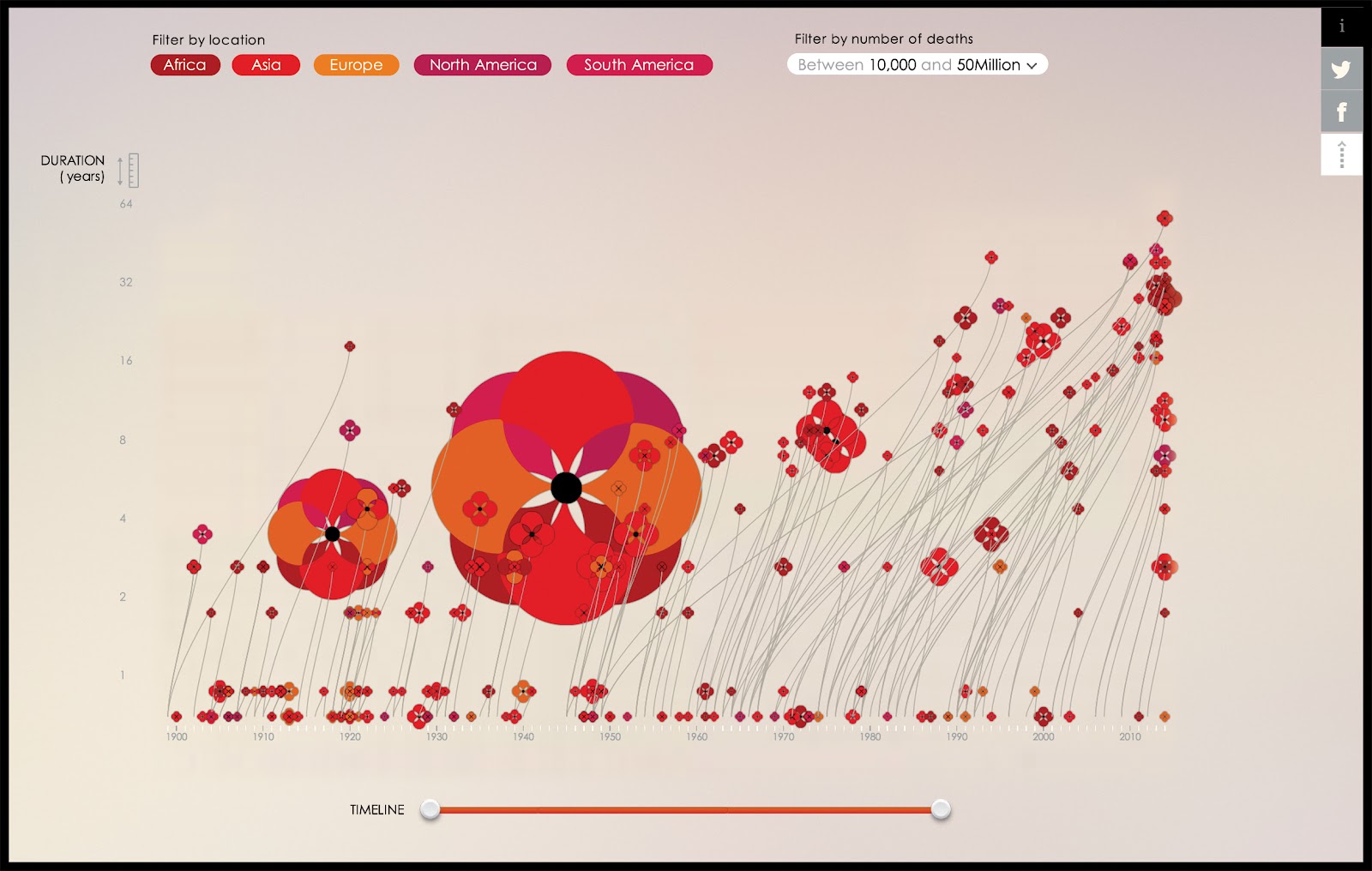
Scatterplot uses the metaphor that the world wars are poppies in a field of commemoration.
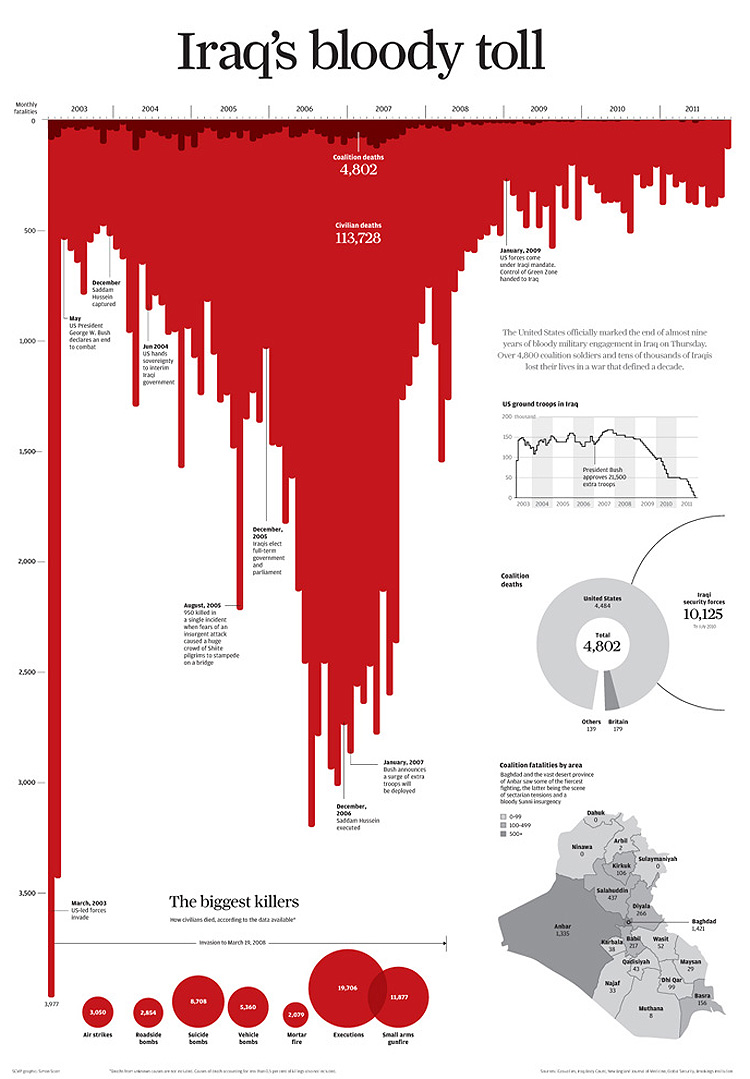
Bar chart uses the metaphor that casualties are blood.
Graphic uses the metaphor that immigration into the US is like the growth of a tree.
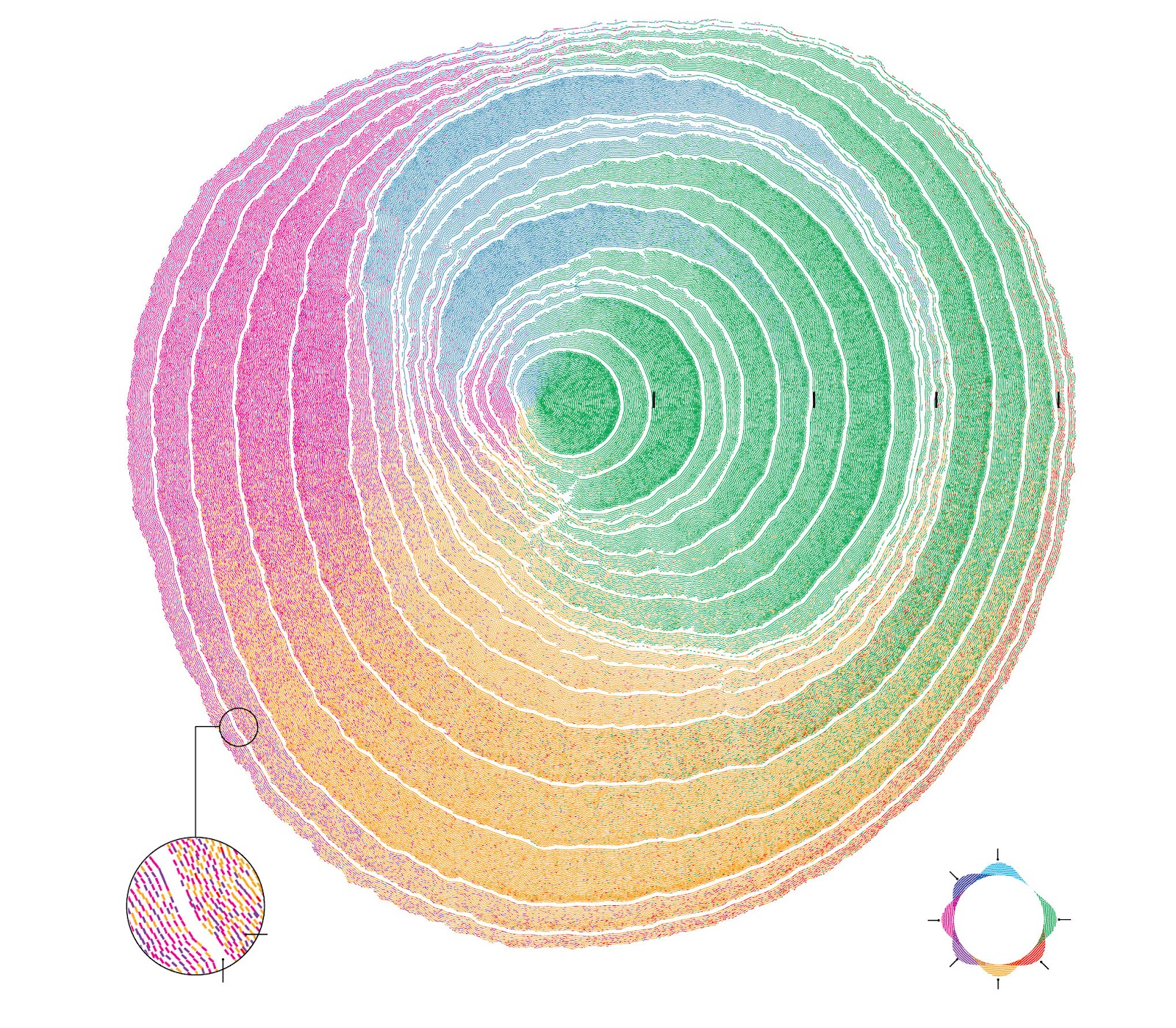
These examples integrate data visualization with visual metaphor masterfully. I'm not going to sugar-coat it: this is extremely hard to do. But you don't have to intertwine the two so closely in order to still benefit from visual metaphors. I find it's much easier to create visual metaphor elements that accompany a chart or text.
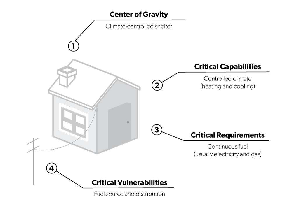
For example, I was asked to translate this concept into something a general audience could understand.
This is barely understandable, right? It's so dense and academic. So I decided to use electricity running to a home as a visual metaphor.
As you get better at creating visual metaphors in general, then it will get easier to integrate them with actual charts.
OK, let's get to the process!
Visual Metaphor Brainstorming Process
Here are the steps at a high level, and then I'll work through an example.
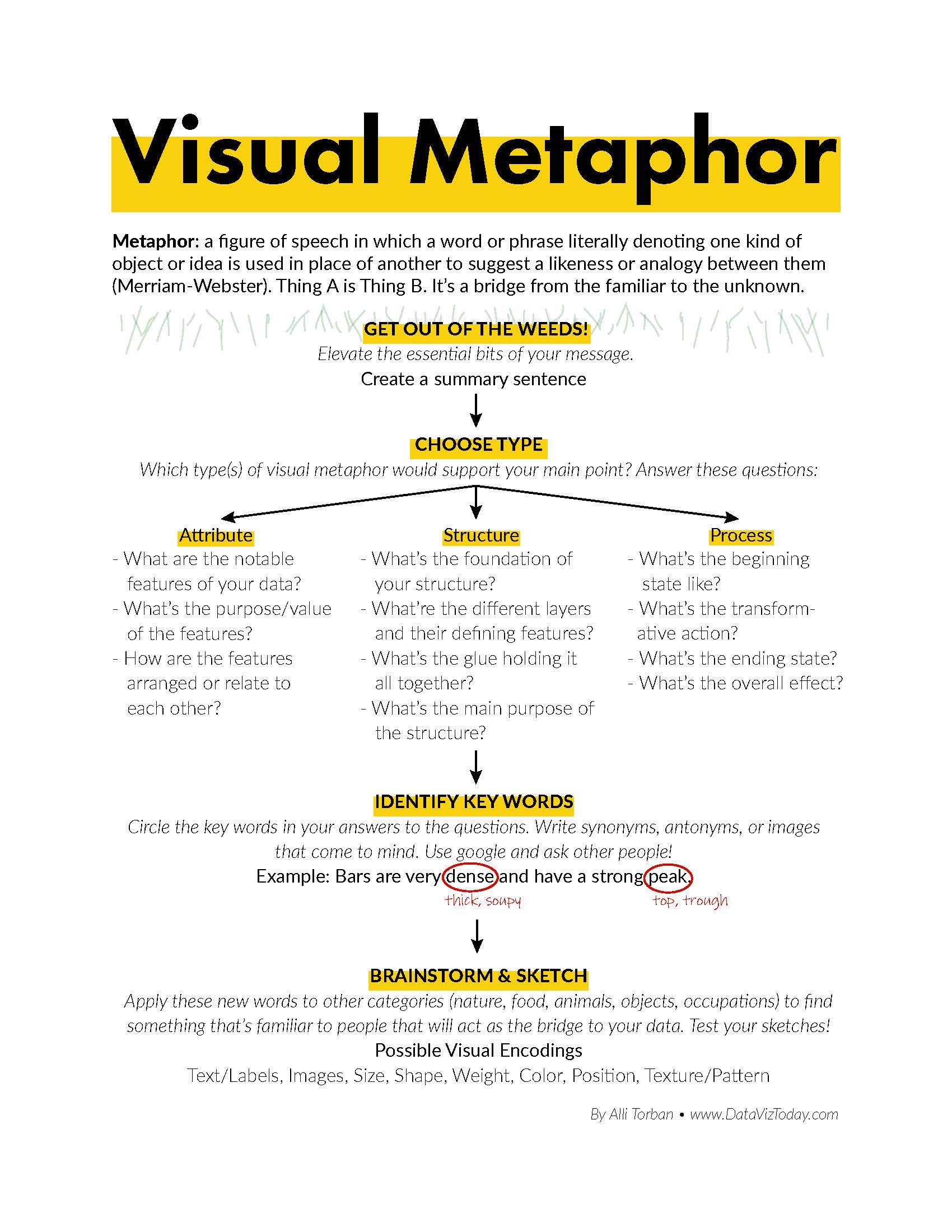
- Get out of the weeds. Write a summary sentence of what you're trying to communicate. This means that you really have to understand what's happening. Work with an expert in the field if you have to.
- Decide if you're explaining an attribute, structure, or process. These are three types that I’ve loosely developed based on my experience. Are you trying to say the attributes of something in your project are like the attributes of something else? Are you trying to explain the structure of something? Or are you conveying some sort of flow or transformation over time?
- Answer a set of questions based on which type you chose. A list of these questions is available as a printable at the end of this article.
- Circle keywords in the answers you wrote down.
- Write down synonyms, antonyms, or images that come to mind when you read your circled words.
- Sketch visuals that correspond to these new words. Apply them to other categories (nature, food, animals, objects, occupations) to find something that’s familiar to people that will act as the bridge to your information.
- Test your sketches. Ask someone else what you think this sketch is trying to convey.
Example
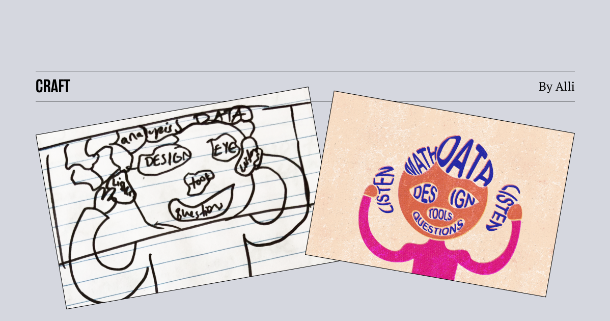
This probably doesn't make much sense reading through the list of steps, so here is a recent example. I wanted to convey the idea that knowing how to use a tool is a small part of being a dataviz designer. I wanted to use it for my podcast artwork for my latest episode about future-proofing your dataviz career. Here's my process:
- Get out of the weeds.
Summary sentence: Tools are just a subset of your dataviz expertise.
- Decide if you're explaining a structure, attribute, or process.
Structure (the make-up of a dataviz designer, all the elements that come together to make one whole being).
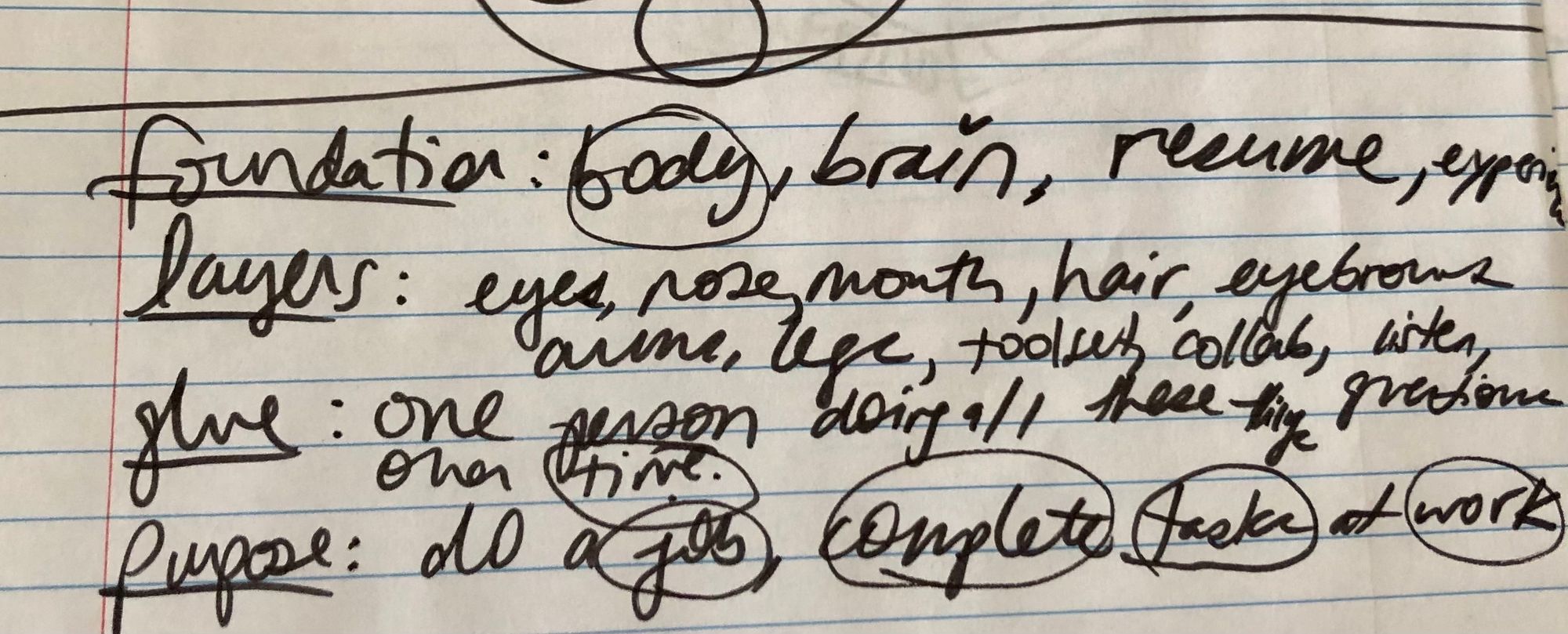
- Answer a set of questions based on which type you chose.
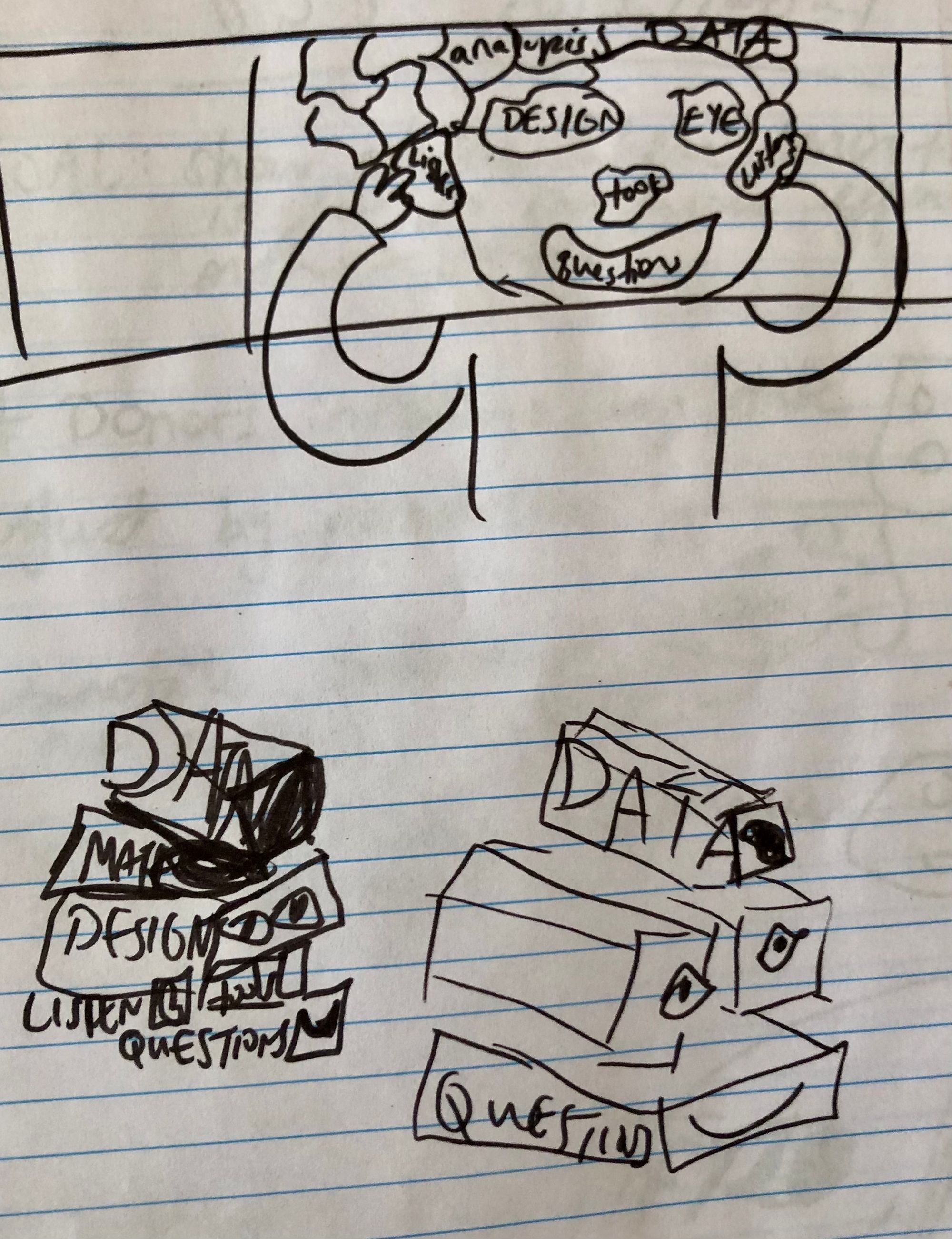
What's the foundation of your structure? body, brain, resume, experience
What are the different layers and defining features? eyes, nose, mouth, hair, eyebrows, arms, legs, toolset, collaboration, listen, questions, paper, ink
What's the glue holding it together? one person doing these things over time
What's the main purpose of the structure? do a job, complete tasks at work
- Circle keywords.
- Write down synonyms, antonyms, or images.
Face, parts, Mr. Potato Head, building block, legos, clock, pin the tail on the donkey, puzzle, checklist, suitcase...
- Sketch what comes to mind when you read these new words.
I immediately gravitated to face, puzzle, building blocks. I sketched these on paper:
- Test your sketches.
I moved to Procreate on my iPad and fleshed out my two ideas. I posted them on Twitter to get people's reactions and see which one resonated better.
trying to use a visual metaphor to illustrate the idea that being a good #DataViz designer is more than knowing how to use tools…
— Alli Torban (@AlliTorban) October 19, 2021
which do you like better? or other idea? pic.twitter.com/LhVeCRnNv9
I heard great feedback, like the building blocks were easier to read but the person felt more, well, human. Overall, it seemed pretty split, so I went with the one that I liked better, which was the building blocks.
There you have it! A brainstorming process that you can follow and create your own visual metaphors. Do you have any tips for creating visual metaphors? Pop into Slack and let us know. Remember, metaphors are bridges, build them and use them!
Here is the printable that you can use: